
Project lead: Jessika Trancik
Research team: Patrick Brown, Joel Jean, Goksin Kavlak, Magdalena Klemun
Contributors: Morgan Edwards, James McNerney, Marco Miotti, Joshua Mueller, Zachary Needell
Institute for Data, Systems, and Society, Massachusetts Institute of Technology
Also see the full report and a schematic of the feedback loop between technology improvement and emissions reductions.
1) Government policies in various countries have driven growth in solar energy
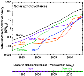
Japan and Germany have been consistent leaders in solar (PV) deployment.
The U.S. has led in government funding of solar energy research and development.
2) Government policies in various countries have driven growth in wind energy
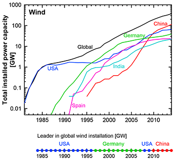
The United States, Germany, and China have been leaders in wind deployment.
The U.S. has led in government funding of wind energy research and development.
3) Wind and solar energy have grown faster than expected
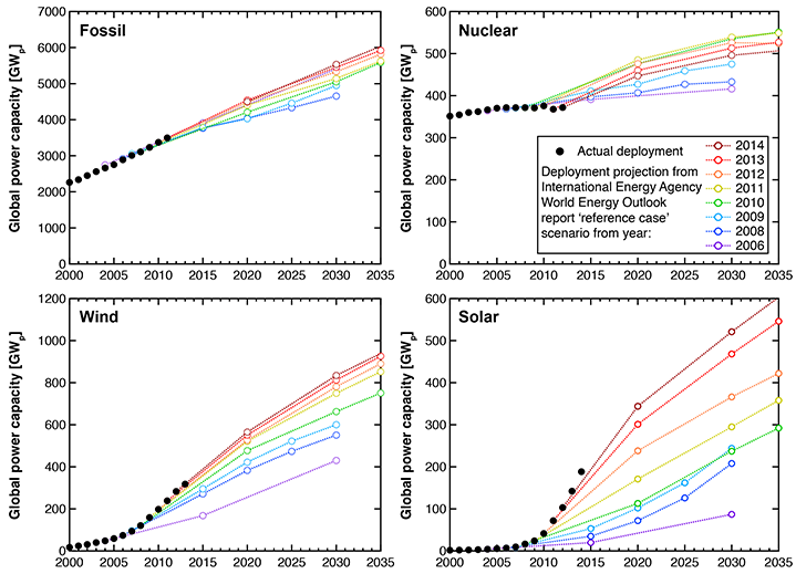
Solar deployment has continuously outstripped global projections from the International Energy Agency.
IEAs 2006 projection for solar power capacity in 2030 was surpassed in 2012.
4) Solar and wind energy costs have fallen as their markets have grown
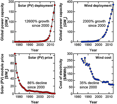
Costs have fallen due to the efforts of private companies as well as the public sector. Costs reductions occur due to economies of scale, learning, and research and development.
5) As solar and wind energy costs have fallen, the cost of reducing emissions has also dropped
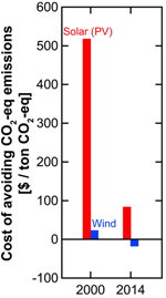
The cost of emissions cuts using solar (PV) has fallen by 85% since 2000.
The cost of emissions cuts using wind has become negative.
(All numbers refer to the U.S. average cost of replacing coal with solar (PV) or wind. Cost estimates do not include energy storage.)
6) Further growth in renewables expected under countries climate pledges (INDCs)
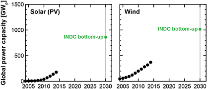
Solar (PV) and wind could grow by factors of nearly 5 and 3 under countries Intended Nationally Determined Contributions (INDCs).
7) Renewables growth under countries climate pledges (INDCs)
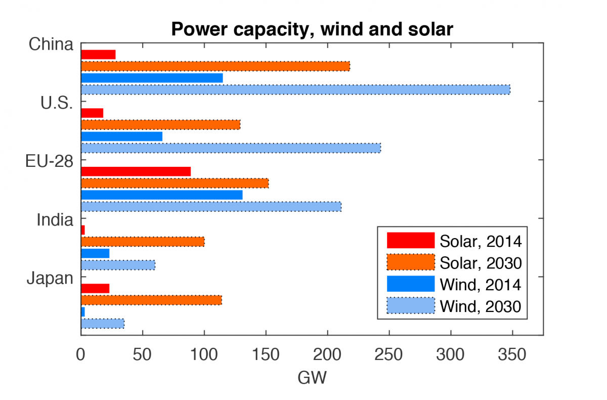
In a high renewables scenario, countries current emissions reduction pledges (Intended Nationally Determined Contributions or INDCs) could lead to significant expansion of solar and wind power in major world economies by 2030.
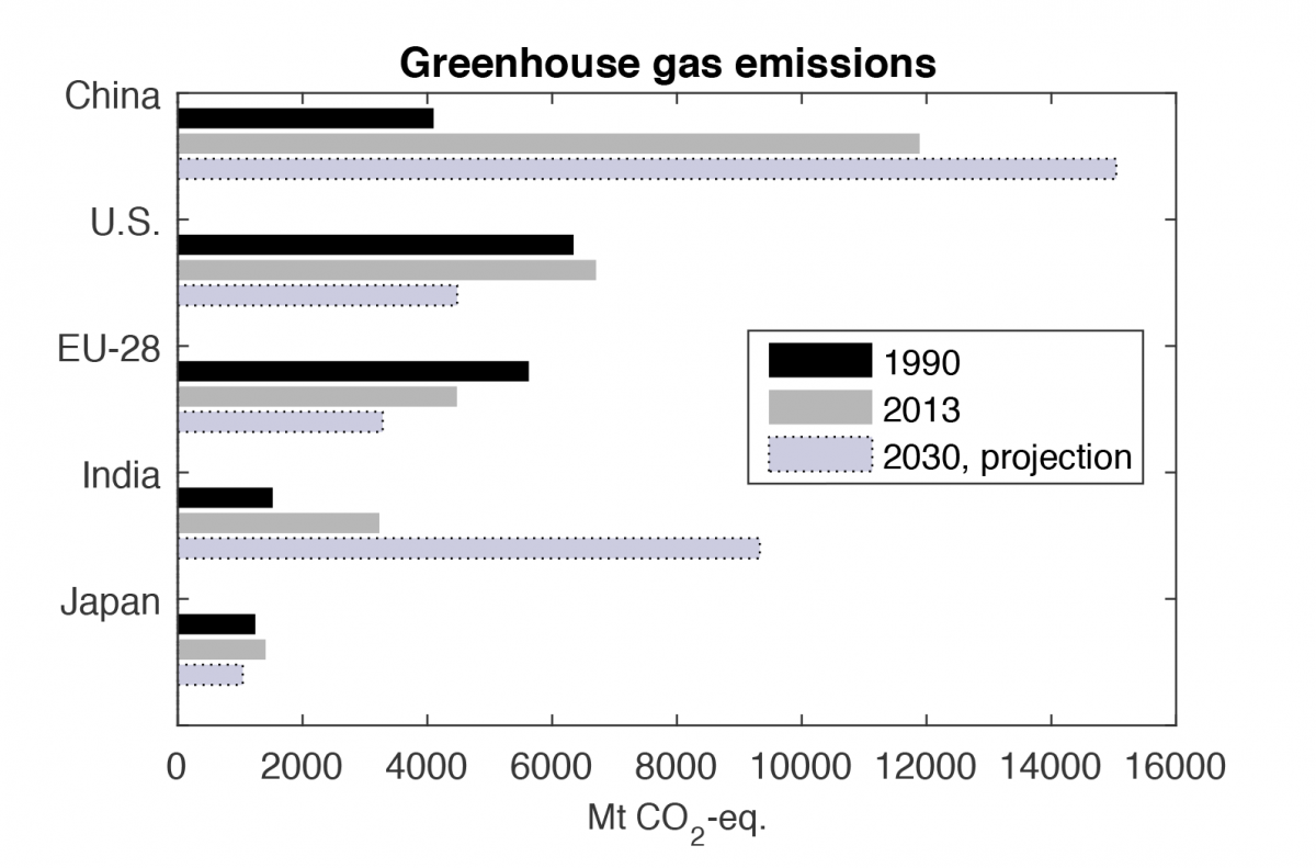
8) Greenhouse gas emissions under countries climate pledges (INDCs)
9) Opportunity for further cost decline under countries climate pledges (INDCs)
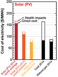
Solar (PV) could become cost-competitive with coal-fired electricity by 2030.
If the health costs of air pollution are included, solar (PV) is already nearly cost-competitive with coal today.
(Cost estimates are global averages and do not include energy storage.)
10) Opportunity for further cost decline under countries climate pledges (INDCs)
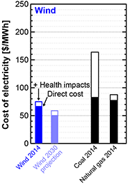
Wind electricity is competitive with coal, and could become even cheaper by 2030.
(Cost estimates are global averages and do not include energy storage.)
11) Cost declines enable increased deployment and greater emissions reductions
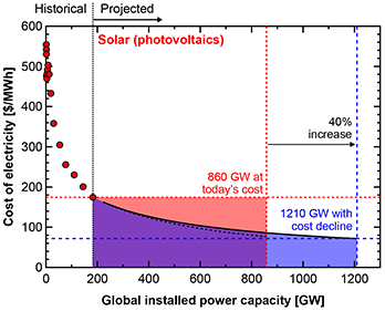
For a given budget, additional solar (PV) could be installed if projected cost declines are taken into account.
12) Cost declines enable increased deployment and greater emissions reductions
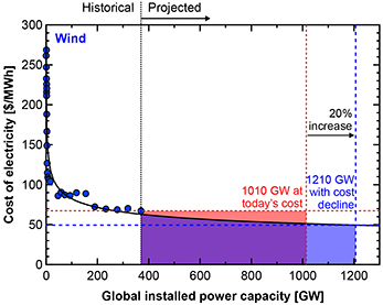
For a given budget, additional wind could be installed if projected cost declines are taken into account.
Press inquiries: miteimedia@mit.edu